Birditudes has been jury selected to be exhibited at ¡Encantada! 2016. The show is being held at the FINE ARTS
BUILDING, EXPO New Mexico, 300 San Pedro NE Albuquerque, NM 87108, from July
6th thru July 27th 2016. Opening
Reception is 5 - 8 PM—July 6th (Awards at 6:30). Reception is free to the public so please
invite your friends.
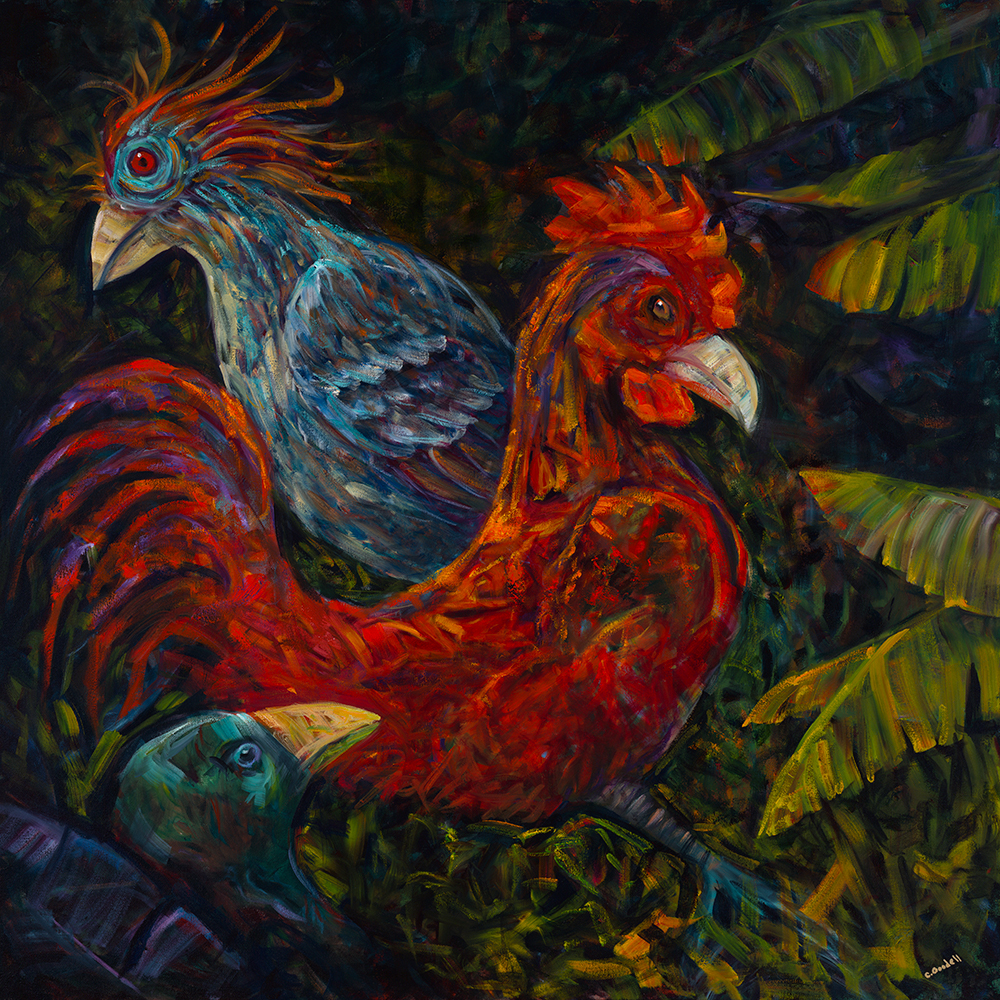
Birditudes Oil on Canvas 36" X 36" $5,000
My latest completion, Birditudes is likely the most evolved piece I've created to date. This is not meant to be a statement of its deep meaning, although there is a narrative within, and it certainly doesn't mean that I have reached some higher level.
What I mean is that this piece went through more change during its creation than any other of mine.
A couple of months prior to starting this, and the day after Christmas my elderly Mom had been diagnosed with advanced stage ovarian cancer and all the subsequent doctor's visits, tests and chemo treatments had begun. I'd helped my parents find and secure help with their daily life, got home health nurses and physical therapy lined up for Mom as well as Meals on Wheels delivery. I'd been cooking, shopping, scheduling appointments, attending doctor's appointments, and visiting to help almost daily for weeks, and all the activity plus the stress of the unknown were taking a toll on my health. Given my own chronic disease this was sure to lead me to a relapse, and I knew I needed to be healthy and available for my parents.
Ten years after my diagnosis I had finally reached a point where I'd successfully learned to implement "pacing", a strategy used to cope with my symptoms and practiced with the intent to avoid relapses, but the added responsibilities (activities) caused me to enter back into the harmful realm of "boom and bust".
For those of you who don't know what this means, let me try to explain. With Myalgic Encephalomyelitis/chronic fatigue syndrome (ME/CFS) the signature symptom is post exertional malaise (PEM), a return of or worsening of symptoms which can last hours, days, weeks, months, or longer, following physical or mental activity of any type or intensity. This can be very minor activity like grocery shopping, or for some severely affected patients simply going to the bathroom or brushing one's teeth.
Pacing is a proactive strategy where all activities, physical and mental, as well as proactive periods of rest are carefully measured, scheduled and executed in hopes of avoiding PEM, or the relapse of viral, cognitive and pain symptoms that usually follow consecutive activities or behaviors requiring energy demands outside one's body's current supply.
In contrast, boom/bust is when one simply does activity without consideration of how it may result, and proactive rest is not regularly practice. This "boom" is usually followed by the "bust" or a crash of hours, days, weeks or more. Next comes rest, sometimes forced because the activity leaves one incapacitated. Then hopefully next is recovery, then resumed activity, or sometimes activity comes before recovery because life activities that can lead to PEM, like cooking, showering, running errands, doctor's appointments, and grocery shopping, housework or childcare are not always easy to schedule. For some there is no recovery, but years of relapse leaving them completely home or bed bound.
As part of pacing, I already live a very reduced life from my pre-sickness level. In order to manage this disease and its symptoms one typically reaches a point where it becomes necessary to take stock of and prioritize all regular activities, omitting all but what is required. For some months before my diagnosis my body had already failed to manage the physical and mental demands of getting through a day of work, and I'd been forced to resign from my job weeks before before the diagnosis. Then for some years my husband Lenny took on the responsibility of many household chores, and fortunately we have had weekly housekeepers and yard maintenance crews, so although I did some laundry, and cooked I focused on my health and I didn't do much more. Gradually as my health improved a little I took on some chores, but with the cyclic nature of the disease I am not always able to do them all. Because of this great reduction in activity and Lenny's help I have been able to continue to do some physical activity and paint. I am fortunate in that regard.
With the added activities for Mom and Dad I decided the only unnecessary activity that I could temporarily stop would be attending my weekly painting sessions, so I didn't do any artwork for a few weeks. Once there was help on board, including recruiting a friend of Mom's who would take her to chemo sometimes, and we had established a weekly routine and knew what to expect to some degree, I went back to art sessions when Mom had a friend who could take her to chemo. That first time back after being gone for weeks was compounded by the fact that I was at the point where I had completed a piece just before Christmas so needed to have a new idea to start painting. My mind was not in a creative place, so I just relied on the faith that being at Oro Fine Art Gallery, in the room where I paint, and talking it over with my mentor, Ricardo, my mind would find its way to the creative space once again. I told him I thought I needed to just throw paint around on a canvas, so he had me pick a color. I chose red, took a large 36"X 36" canvas and painted a giant spiral in red. The space between became the complimentary green, and all of it was created in a hurry with generous amounts of paint swirled in textures with various visible brush strokes. It felt like an emotional dump.
The next couple of sessions were spent studying the work in progress. Embedded in the strokes were human figures, lots of bodies appearing to be doing things, like swimming, running, etc. So over those next couple of sessions I began outlining them wondering why they had presented themselves in this piece. Given that this disease has limited my activity level and altered my former physical nature I can understand why I'd paint active human figures engaged in athletic or physical activities, but I felt like I was struggling with how to form this into a joyful narrative piece. Eventually as my mind cleared, and through discussion with Ricardo, I was reminded that although a portion of my life circumstances may be somewhat uncontrollable, I can steer the direction of my art.
So, I began to look for other hints in the piece; something to which I could relate, fall in love with, and manage moving forward. Birds. There were obvious beaks, so the three birds you now see came to life. They had presented themselves out of the other chaos, each with its own individual attitude. I have an affinity for birds and flora; in the past I have had recurring dreams of flying, so birds make sense.
The two main birds in this composition, male and female, have had a disagreement of some kind. The rooster-ish male struts off arrogant and angry, but suddenly, and with some self reflection he begins to see that he may be partially at fault so looks questioningly to the viewer for input. The female, with her dignity intact has emotionally separated herself from him, patiently waiting for the time when they can calmly reconcile their differences. The small bird in the foreground sits somewhat protected under a leaf looking on throughout the entire episode, uninvolved, and wondering, "what the heck was all that noise about"?
#May12BlogBomb